Karsyn is a designer based in Brooklyn, New York, with a background in Communication Design from Parsons. She works across branding, editorial, and digital design, focusing on the small details that shape how something feels.
Before design, she worked as a hairdresser and later moved into photography and marketing. Those experiences taught her how to notice things, listen, and understand how visuals and language can come together to tell a story.
Her work is rooted in systems thinking, emotion, and rhythm. Whether she’s designing a publication, a user flow, or something tactile, she’s always thinking about how people move through it. She aims to make work that feels intentional, personal, and a little unexpected.
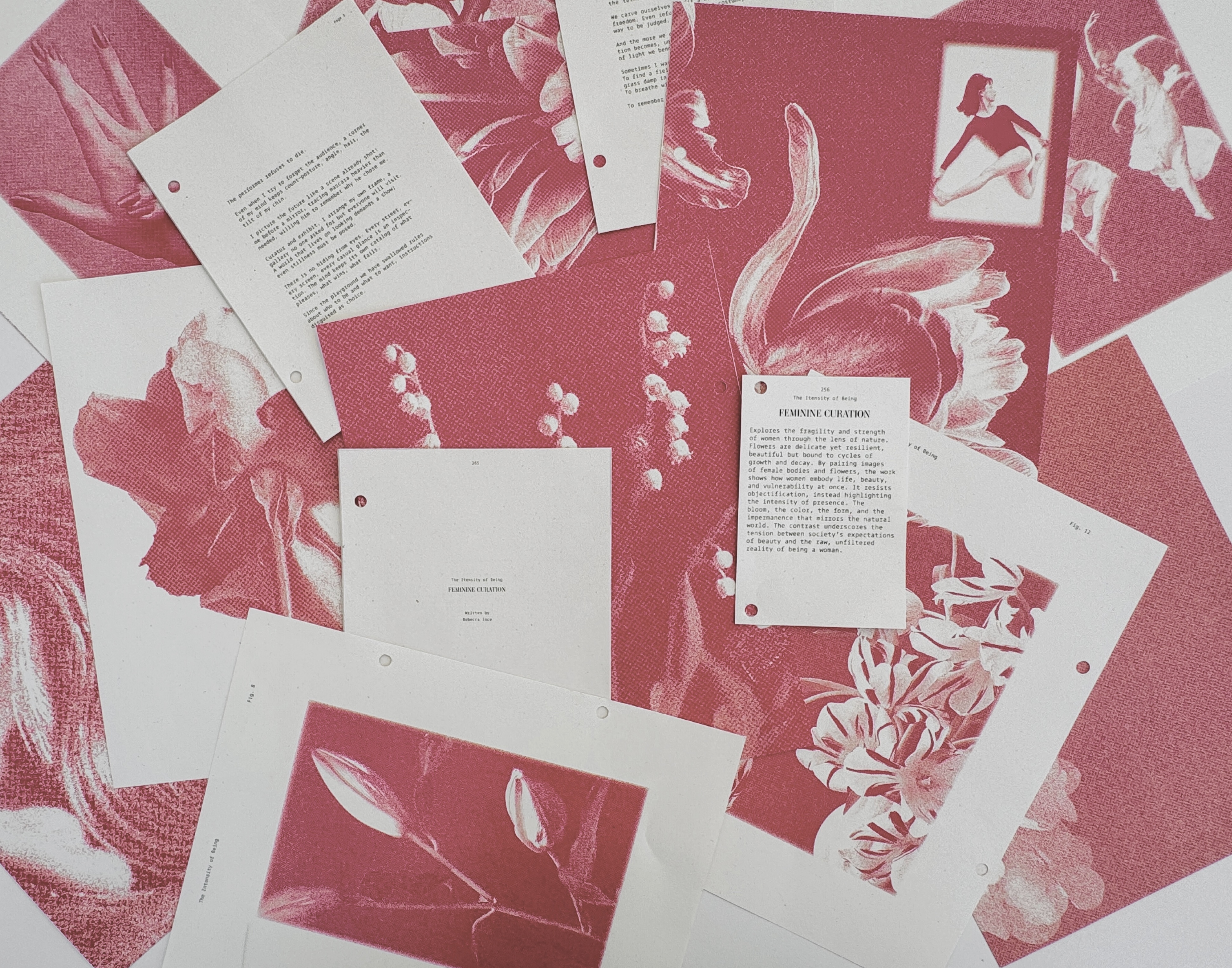
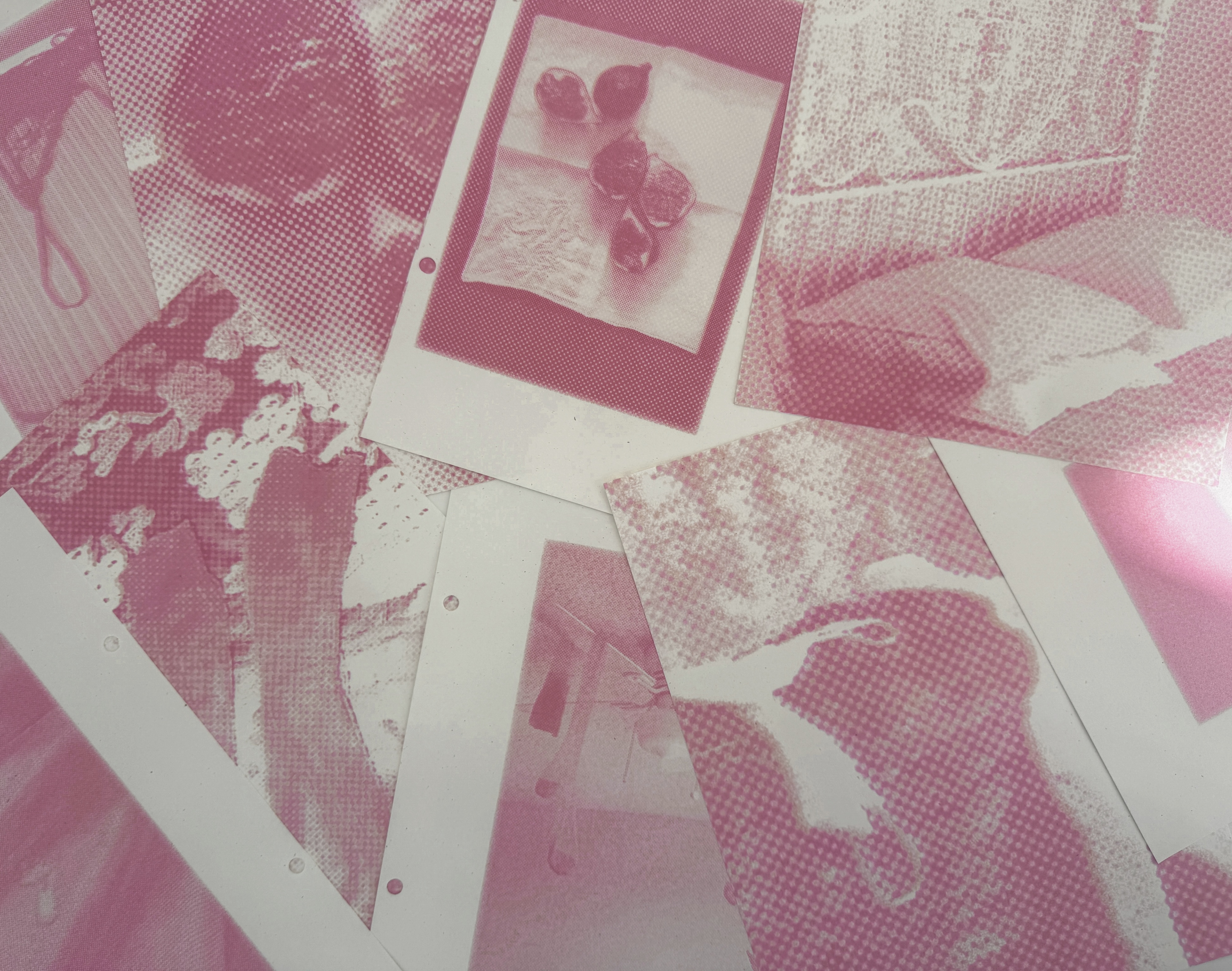
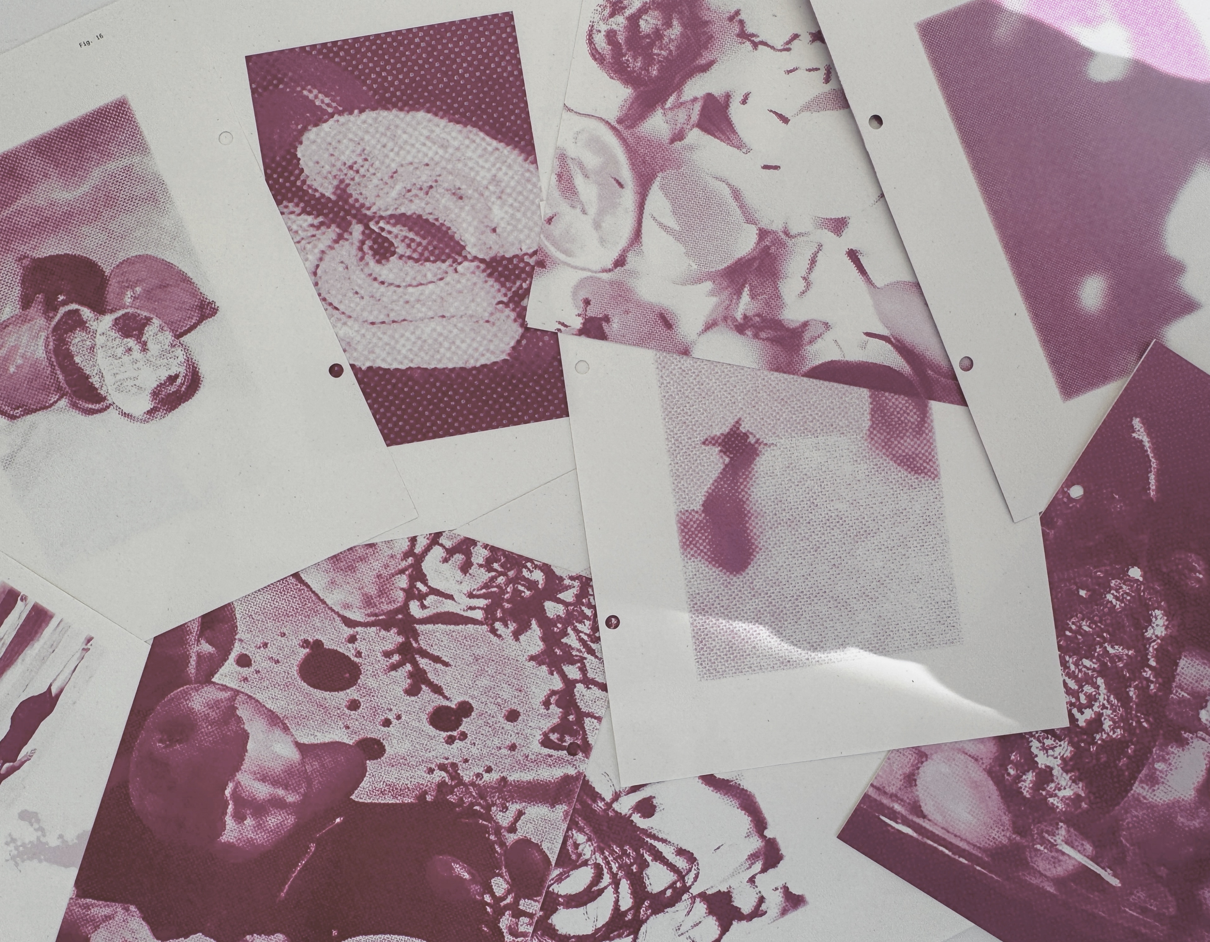
The Intensity of Being
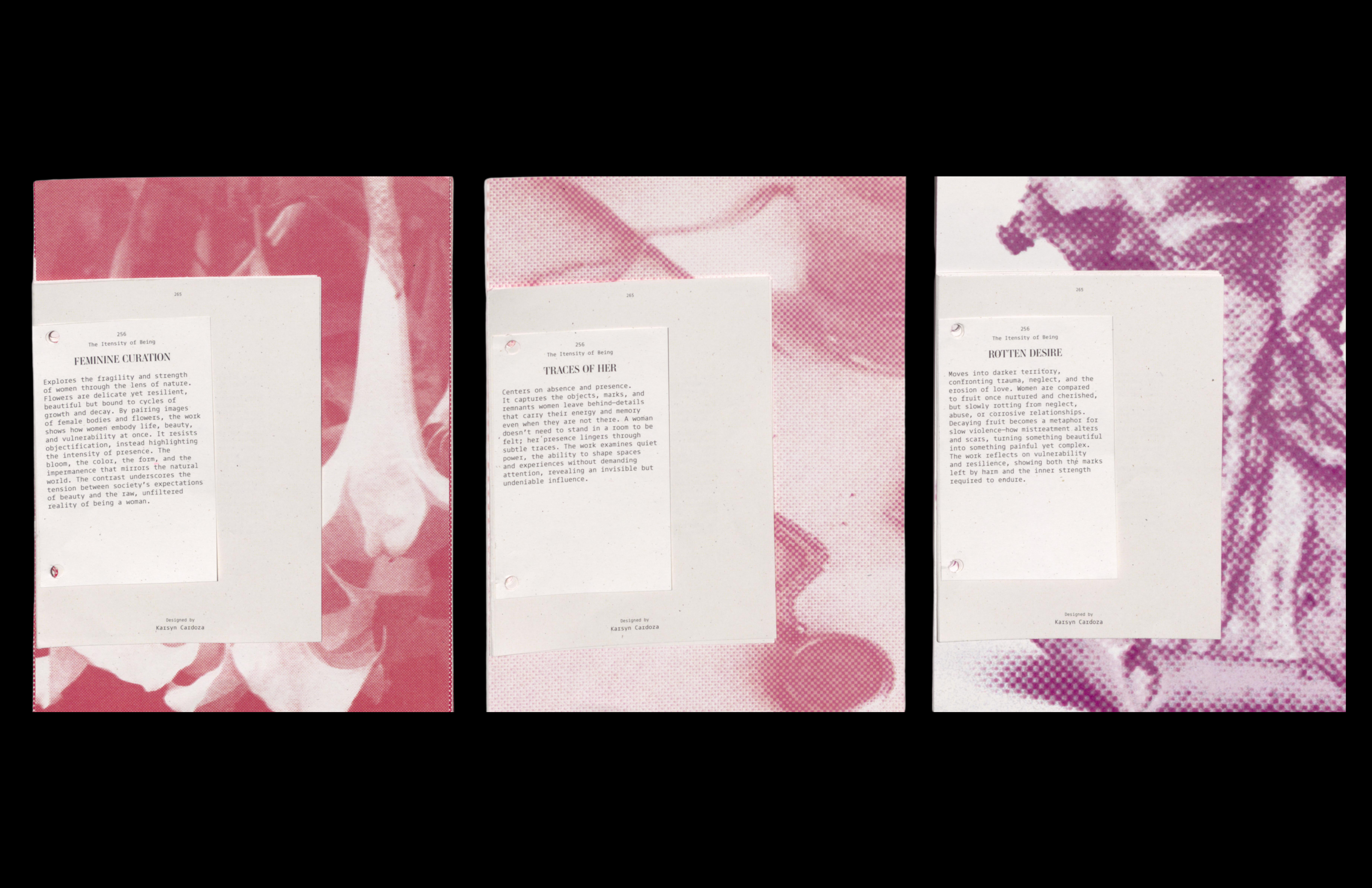
Female Curation, Traces of Her, Rotten Desire
A three-part series exploring the intensity of being a woman. The jumper-ring binding and photo treatment create a subtle discomfort to draw viewers into the narrative. Each section includes a written piece by women reflecting their relationship to the topic.
Feminine Curation examines beauty standards, comparing the feminine form to flowers. Traces of Her captures the lingering presence of feminine energy through objects, marks, or a lit space. Rotten Desire explores trauma, the dangers women face, and daily struggles, comparing the female form to decaying fruit to highlight the tension between beauty, vulnerability, and harsh realities.
Venus
A typeface inspired by woman.
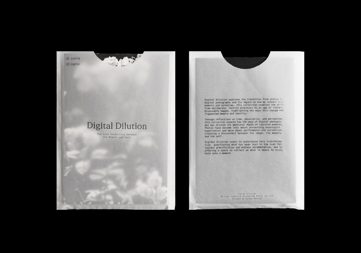
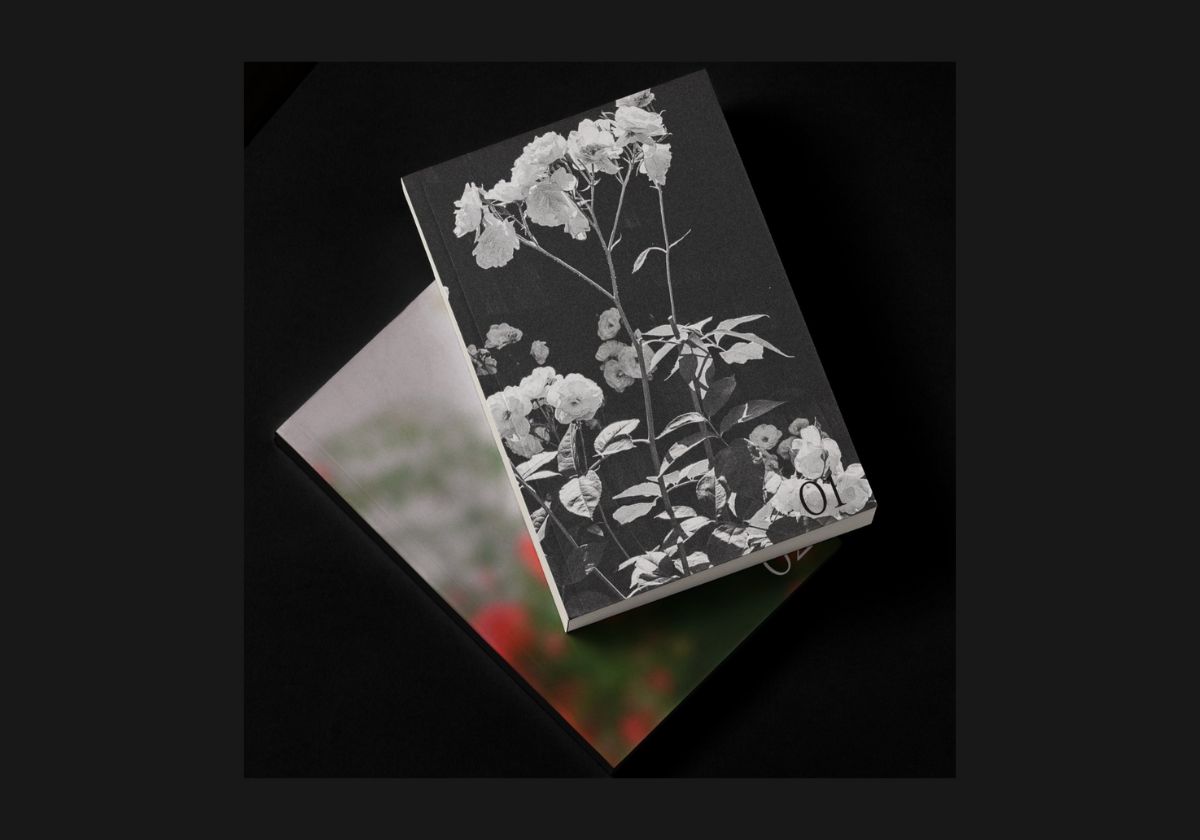
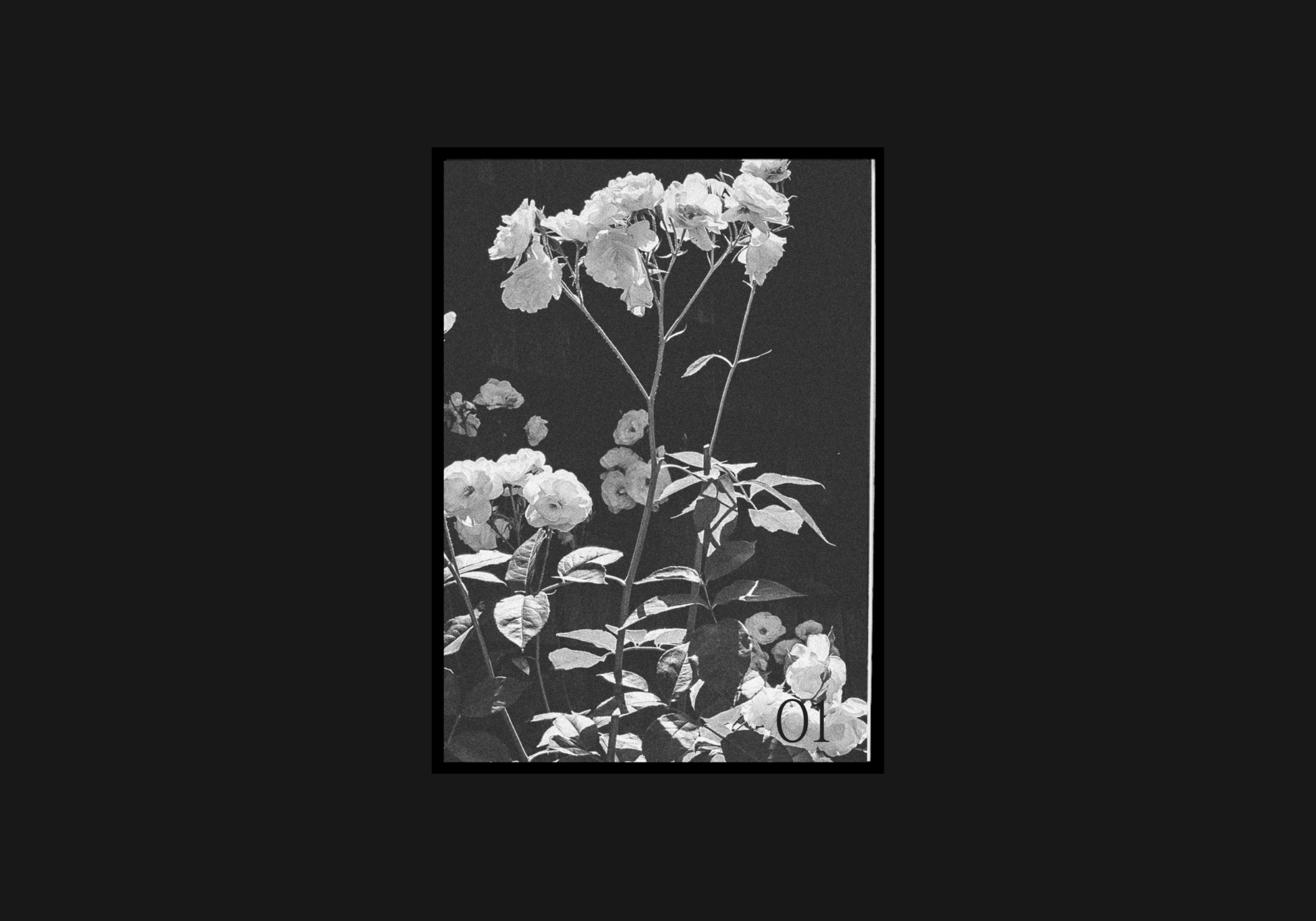
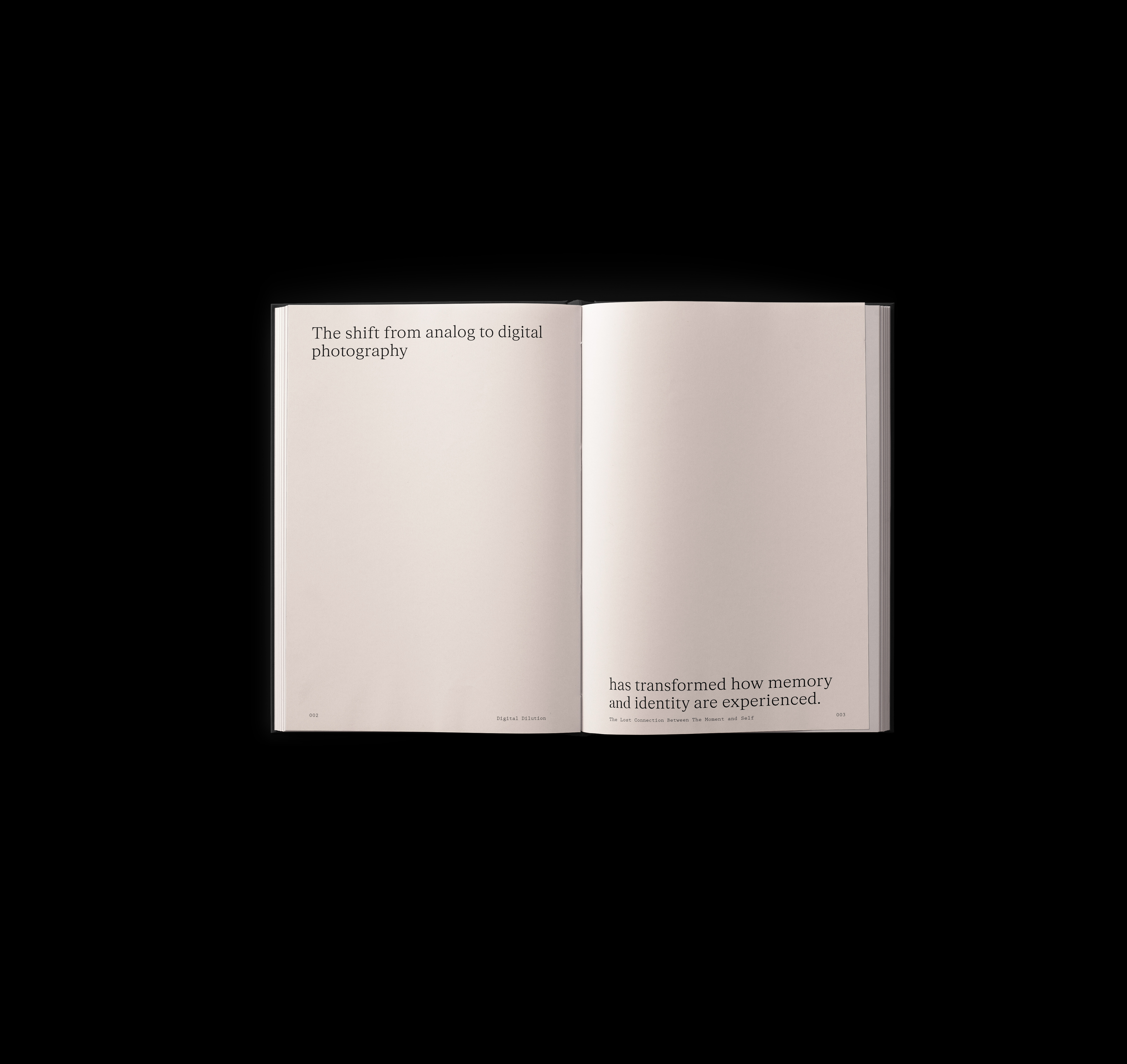
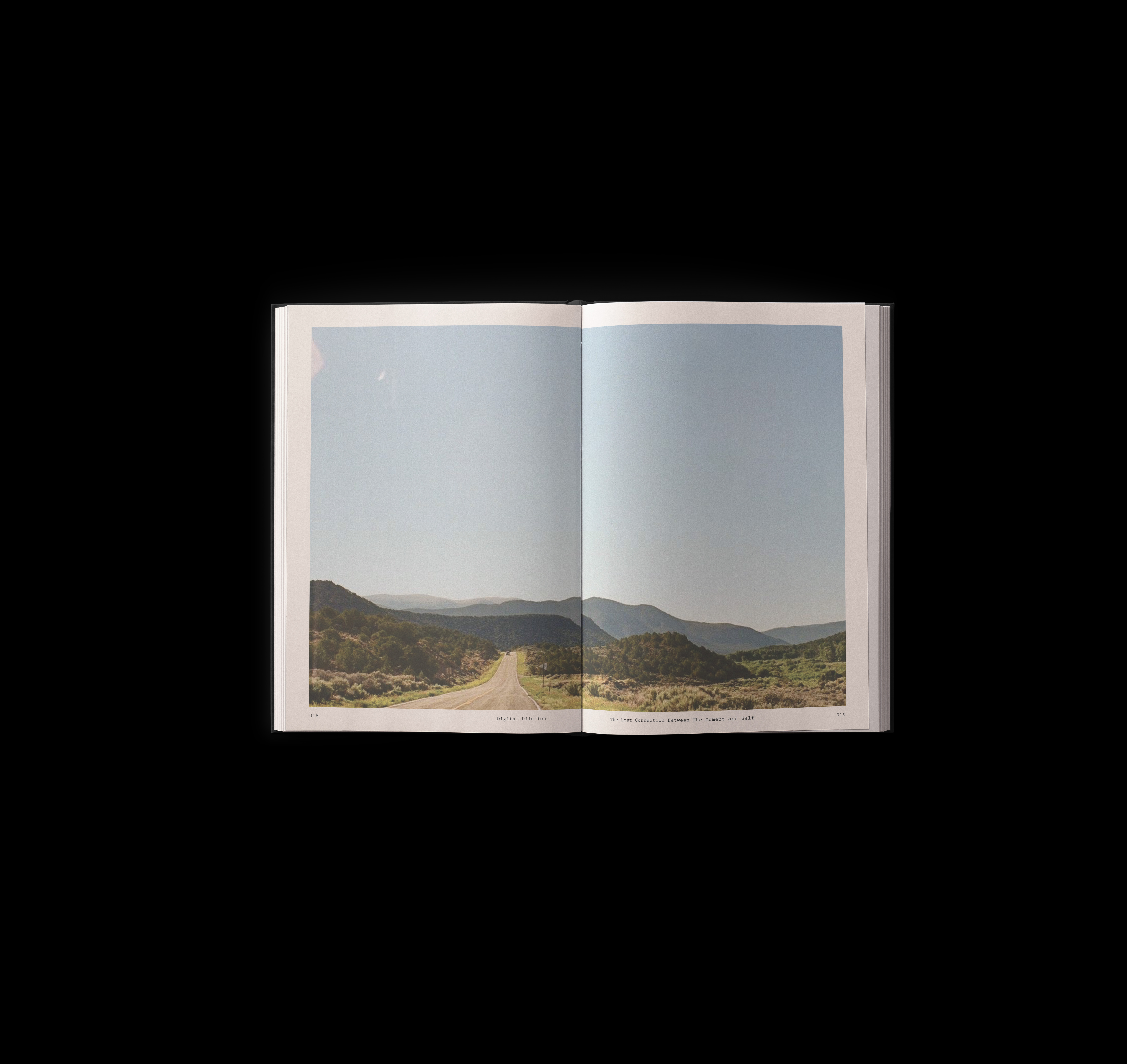
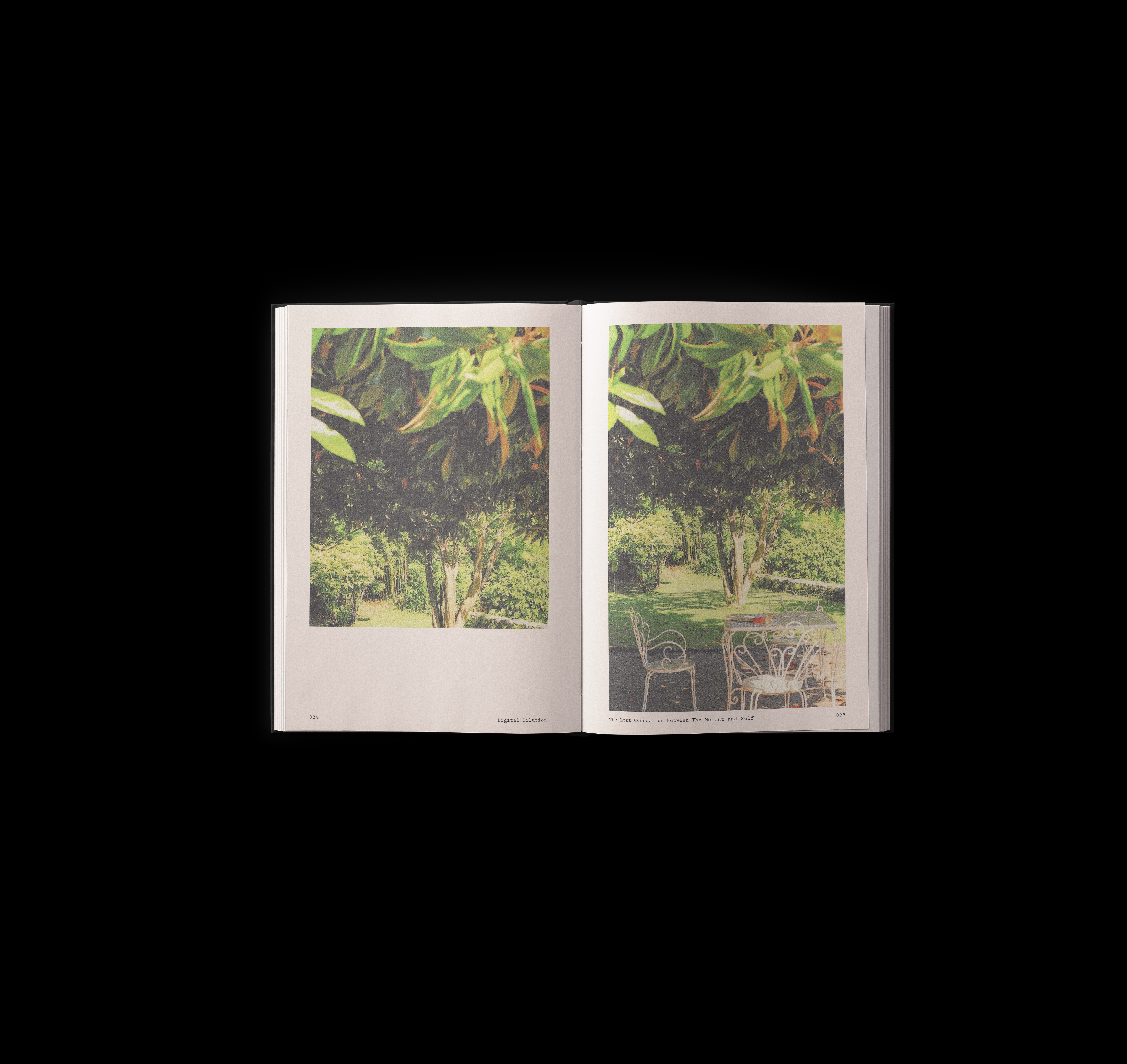
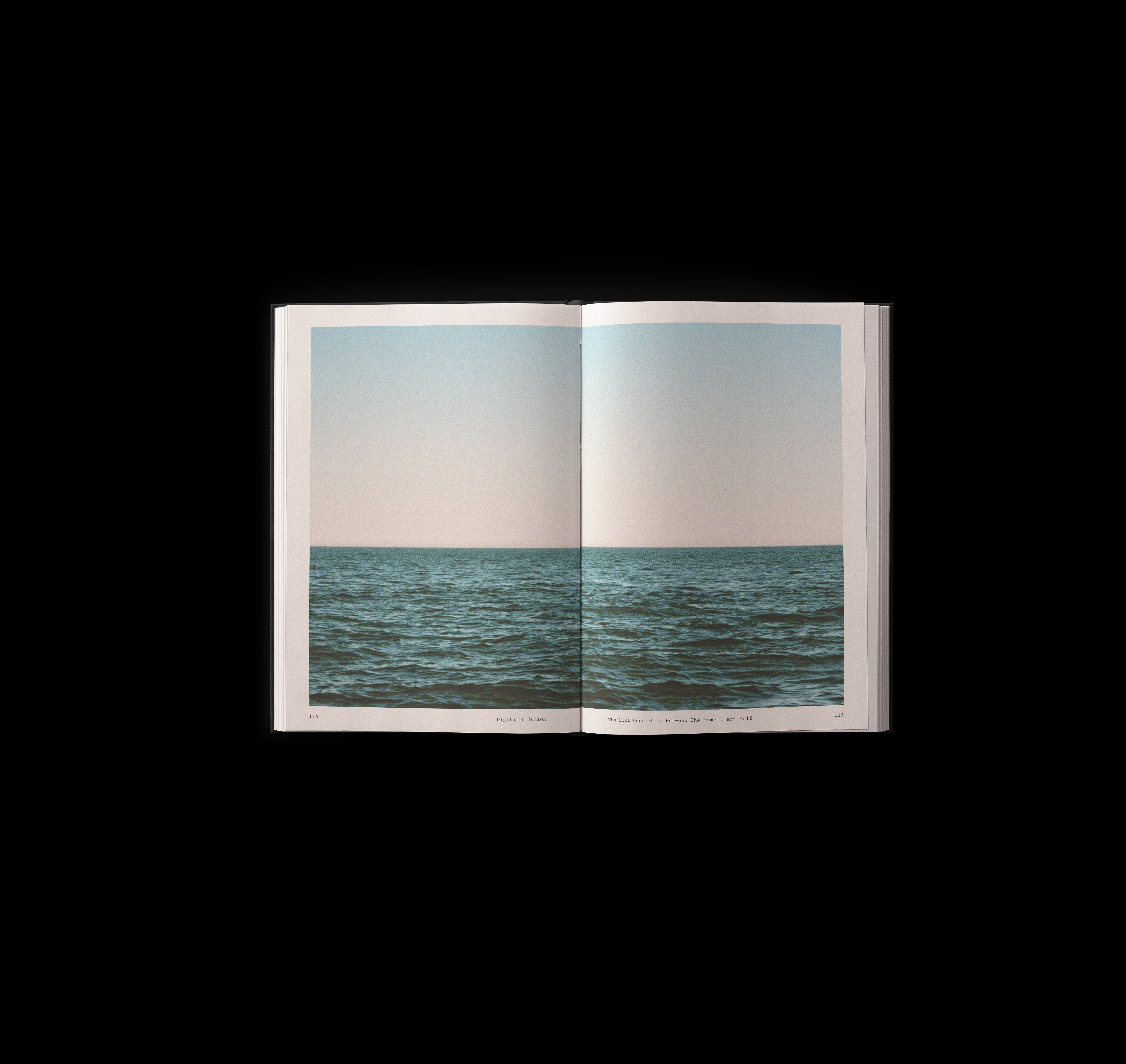
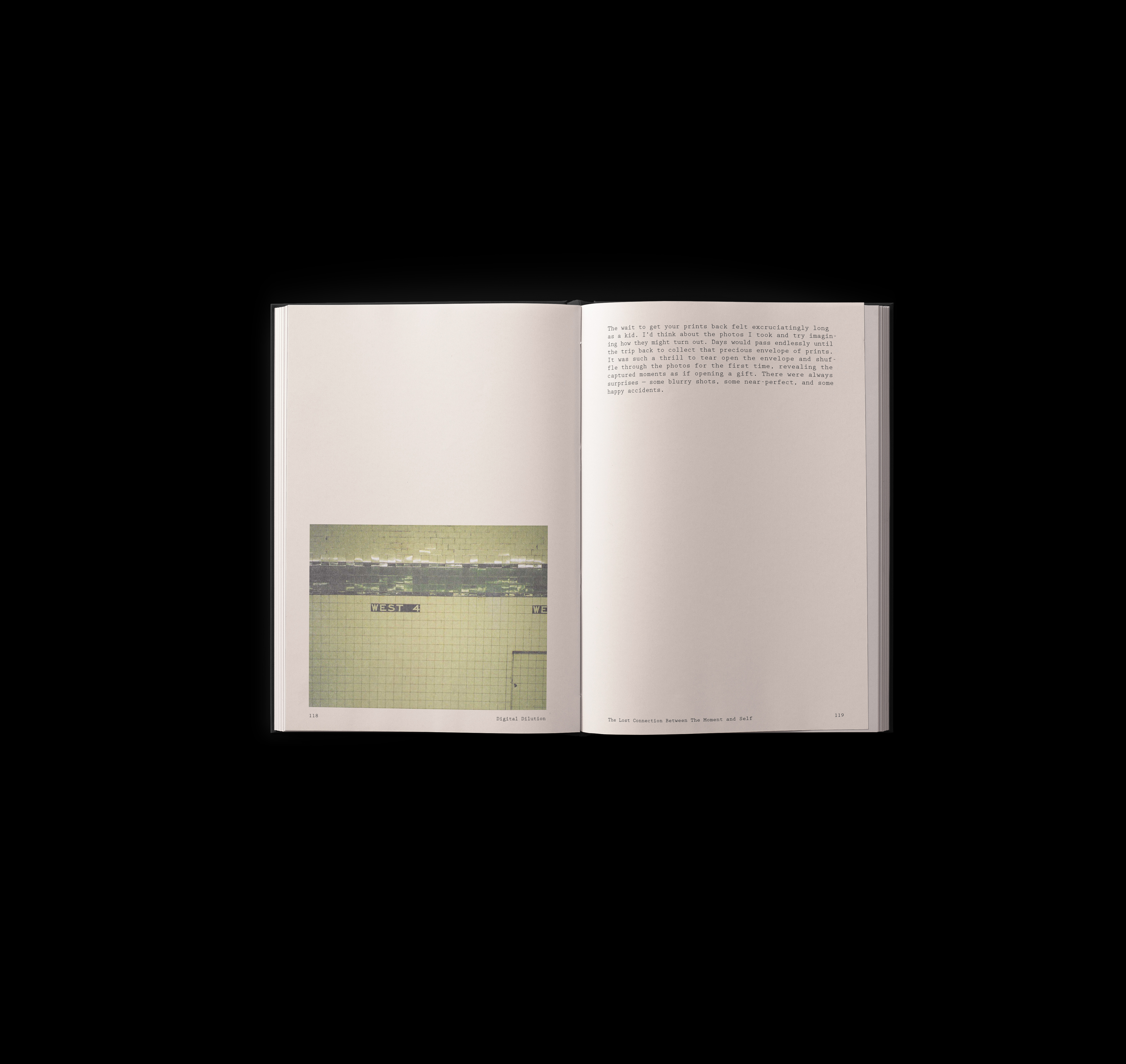
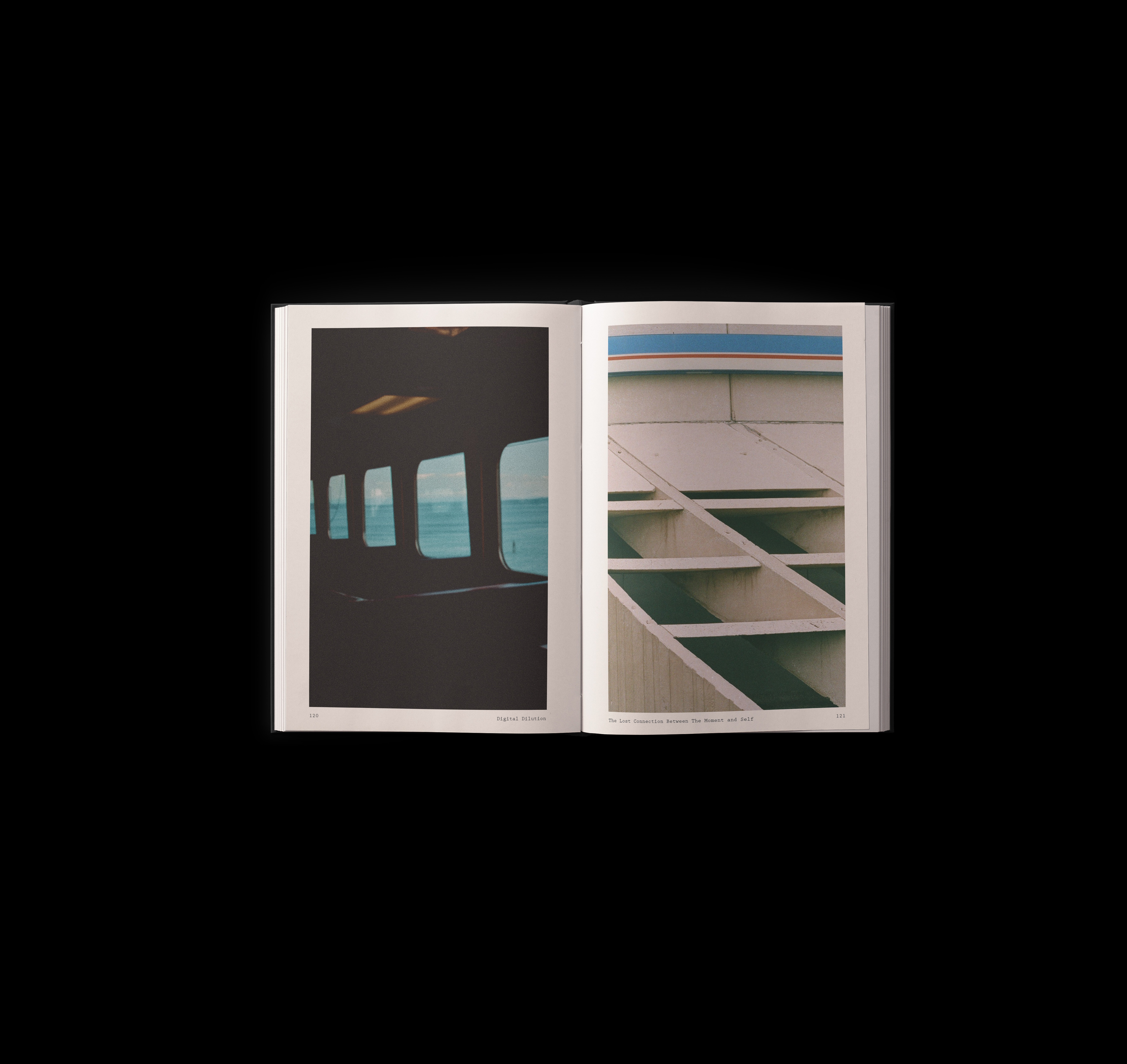
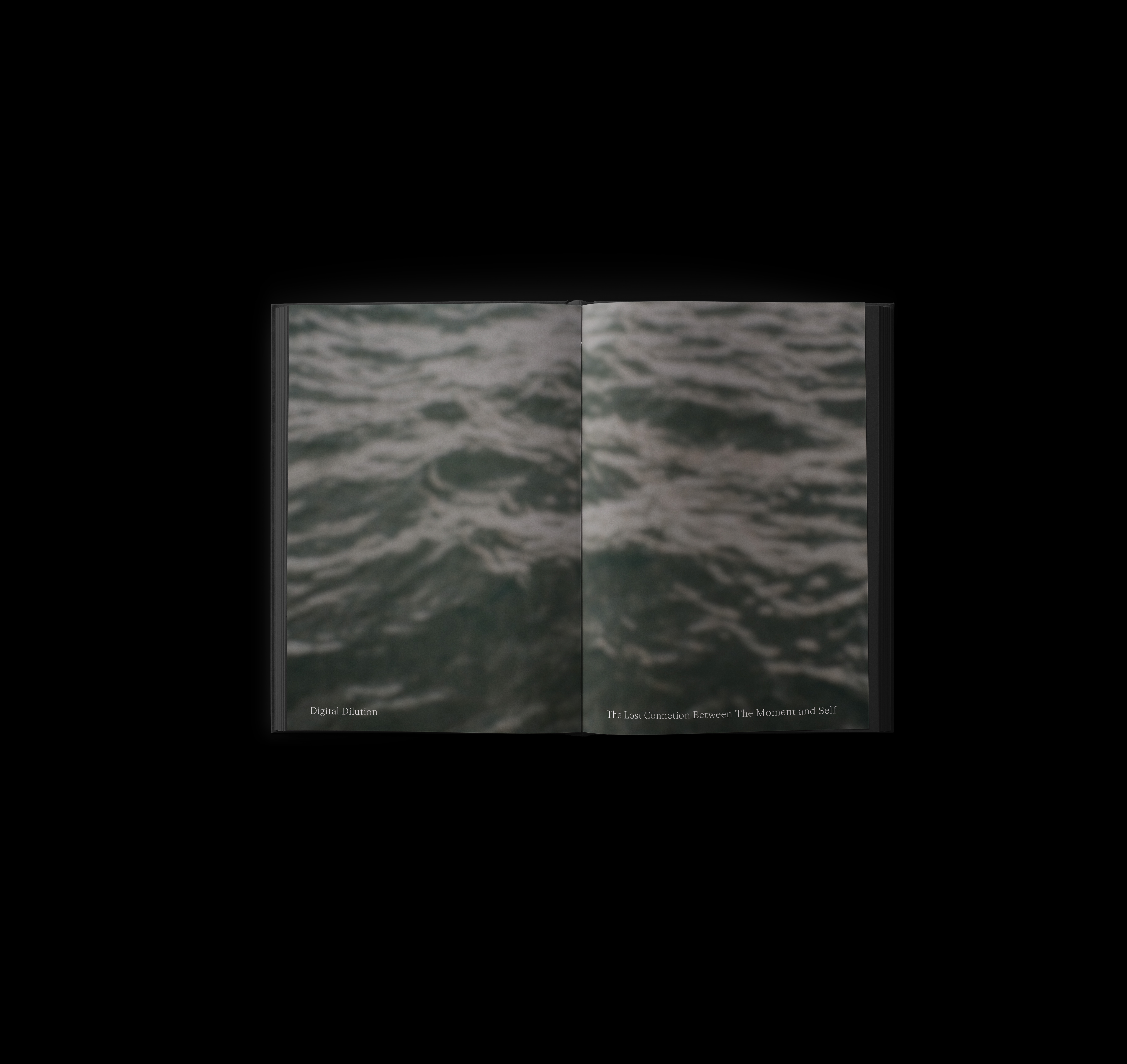
Digital Dilution
The Lost Connection with the Moment and Self
Digital Dilution explores how the transition from analog to digital media has transformed the way we engage with time, memory, and identity. Through imagery and text, the collection examines how the ease and speed of digital technology has distanced us from fully experiencing the moment. It reflects on the emotional and personal disconnection that has emerged in the shift to a more fragmented, fleeting digital culture.
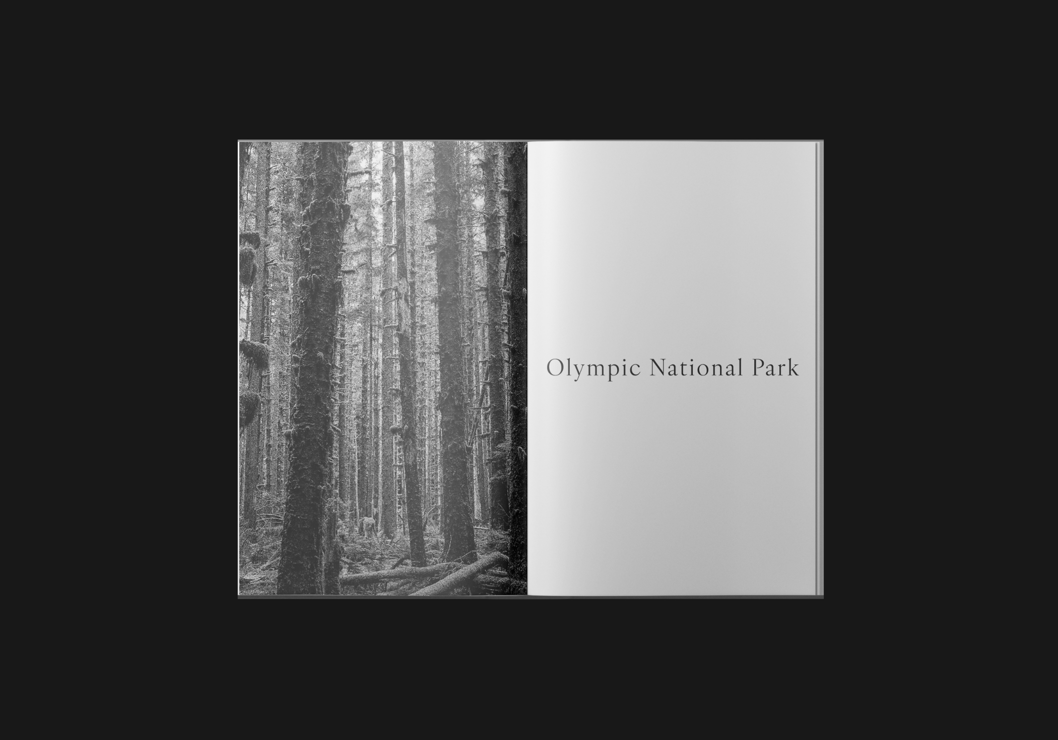
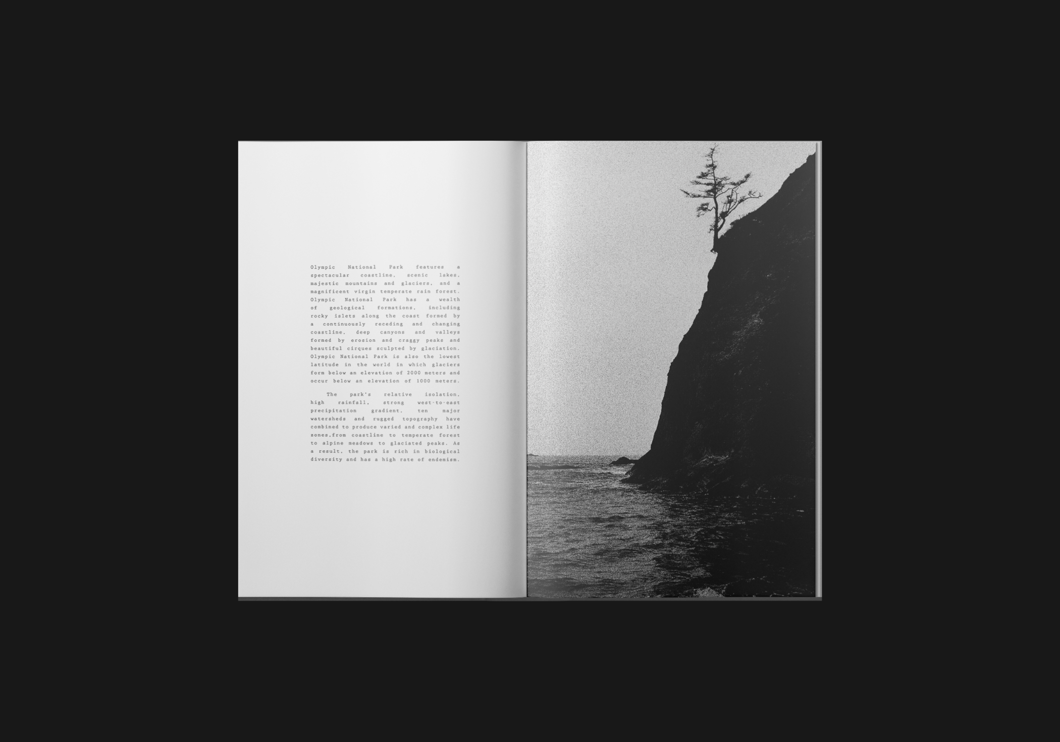
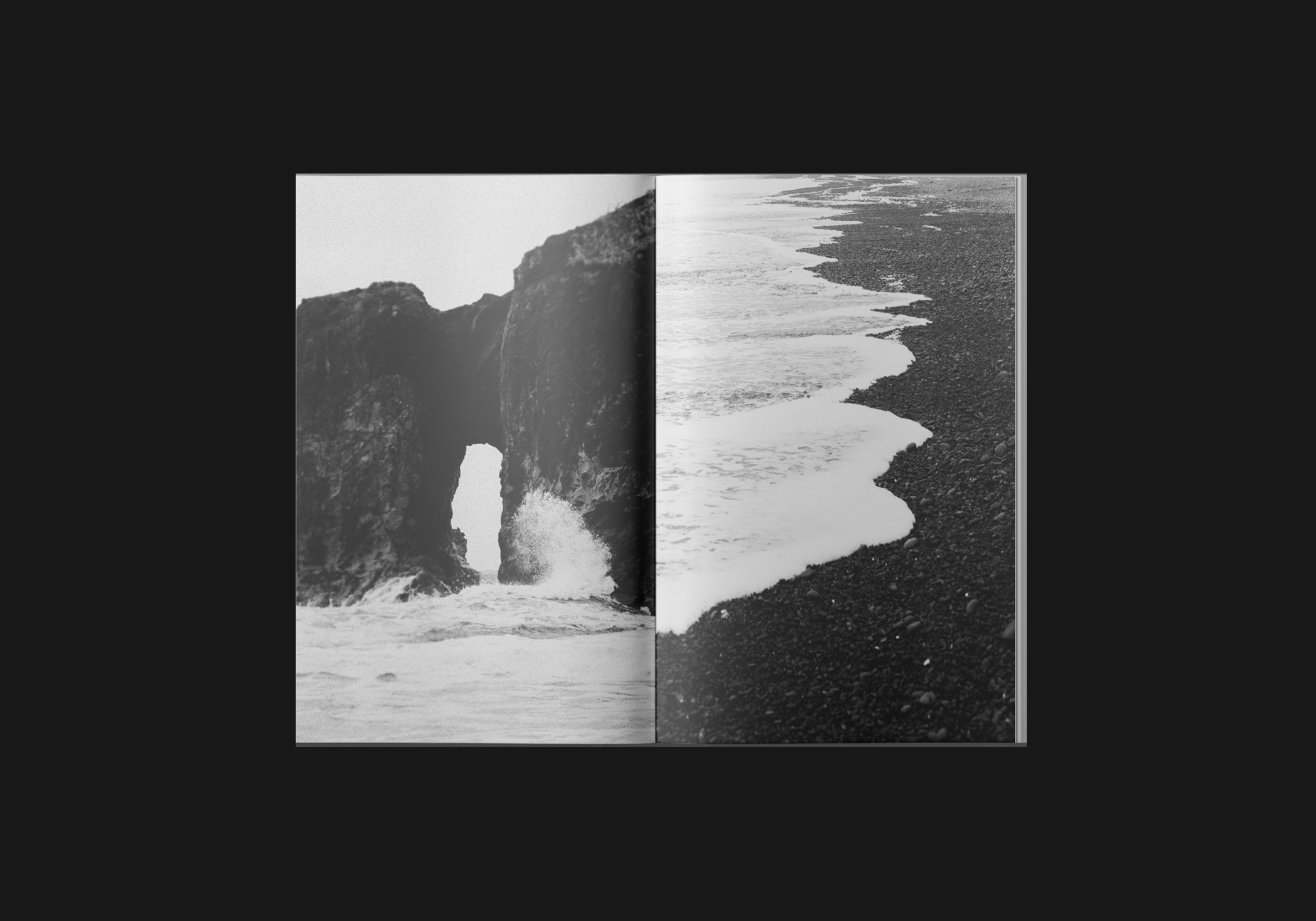
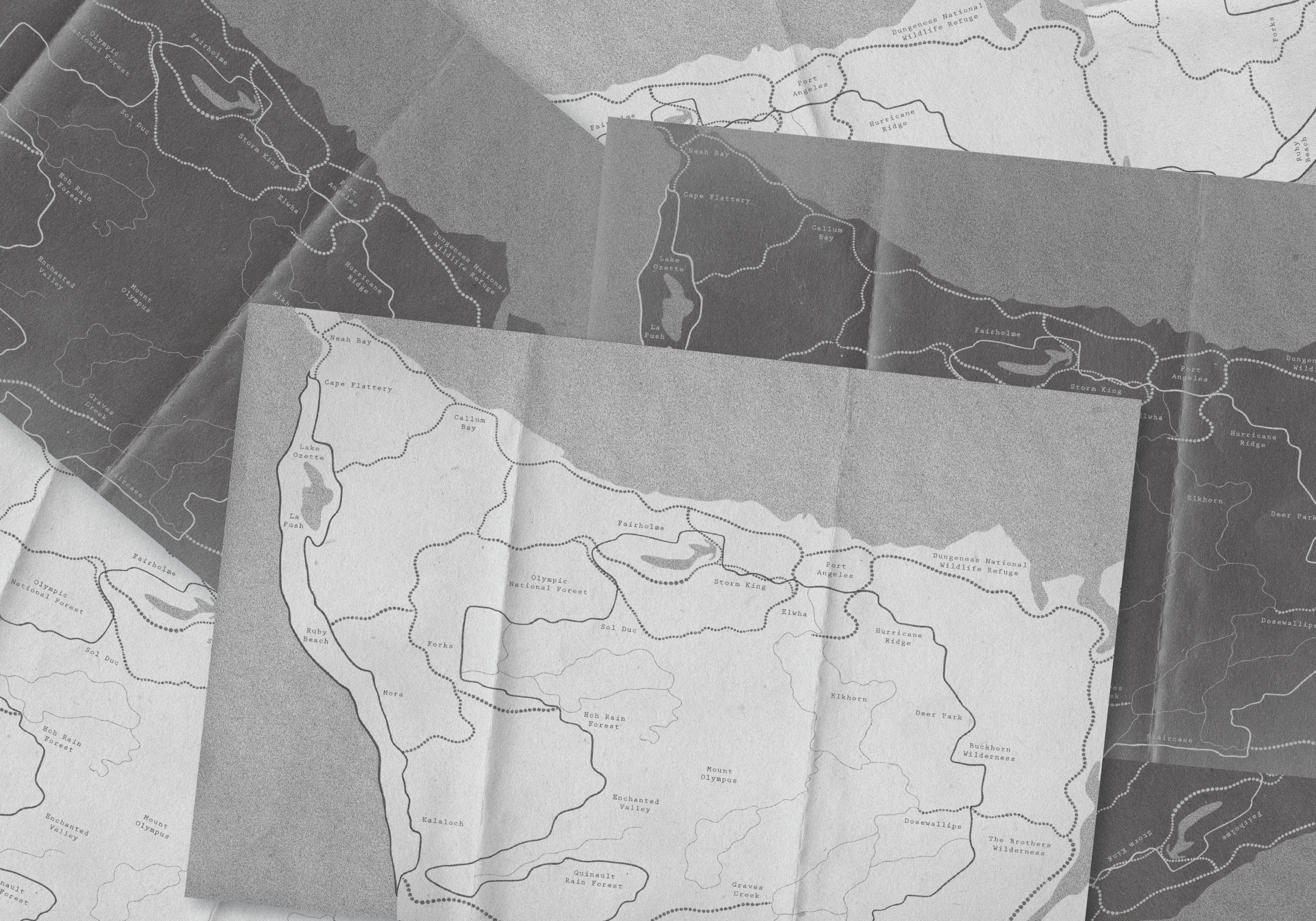
Olympic National Park
Promotional Series
Olympic National Park is a promotional series celebrating the park's unique atmosphere. Inspired by its dreamlike quality—the white skies, heavy fog, and disorienting sense of scale—this series brings that feeling directly to the viewer. Using black-and-white risograph photography to amplify the park’s sense of mystery, and intentionally chaotic typography that mirrors quick-changing scenery, the project encourages visitors to unplug and experience the park for themselves.
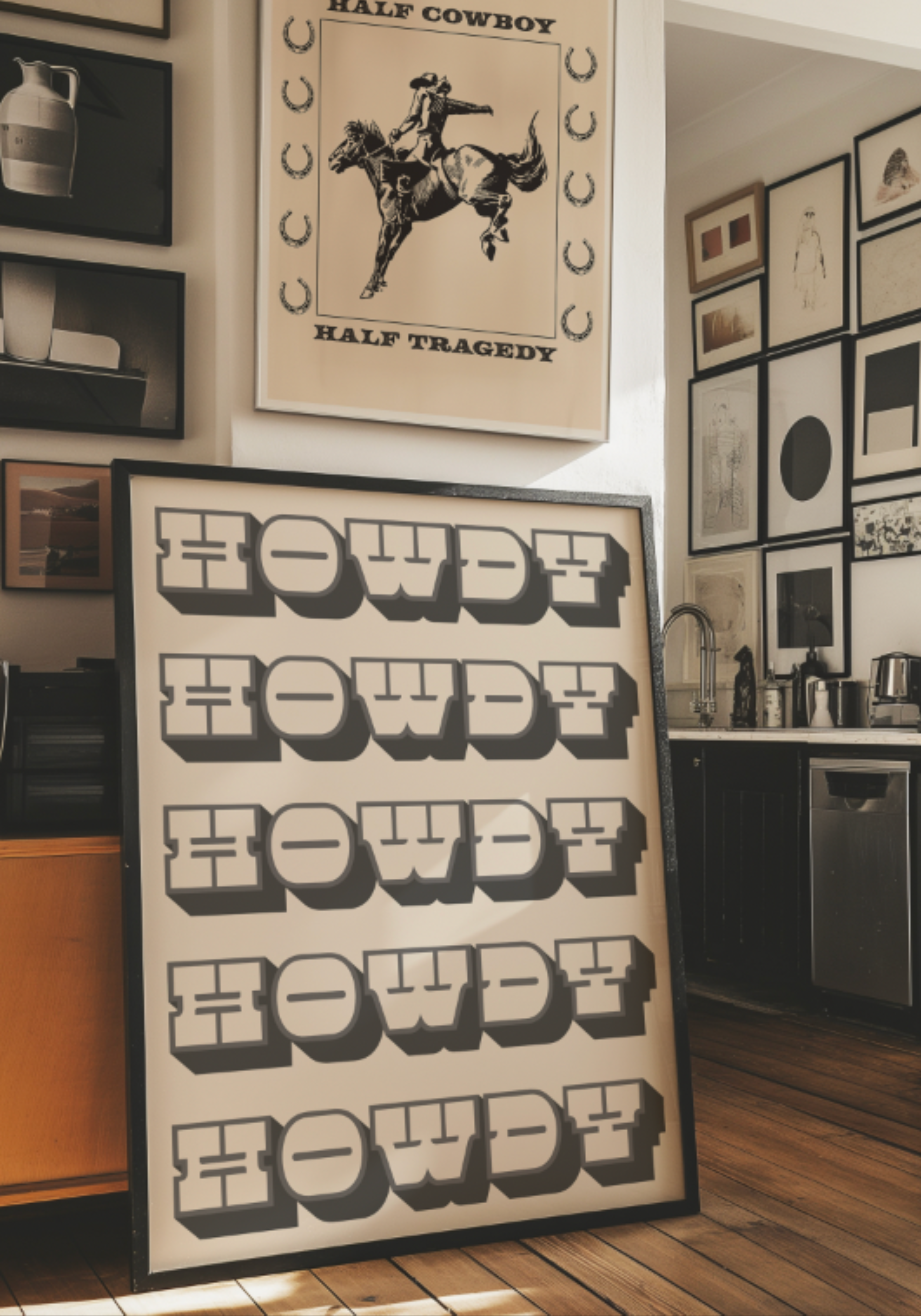
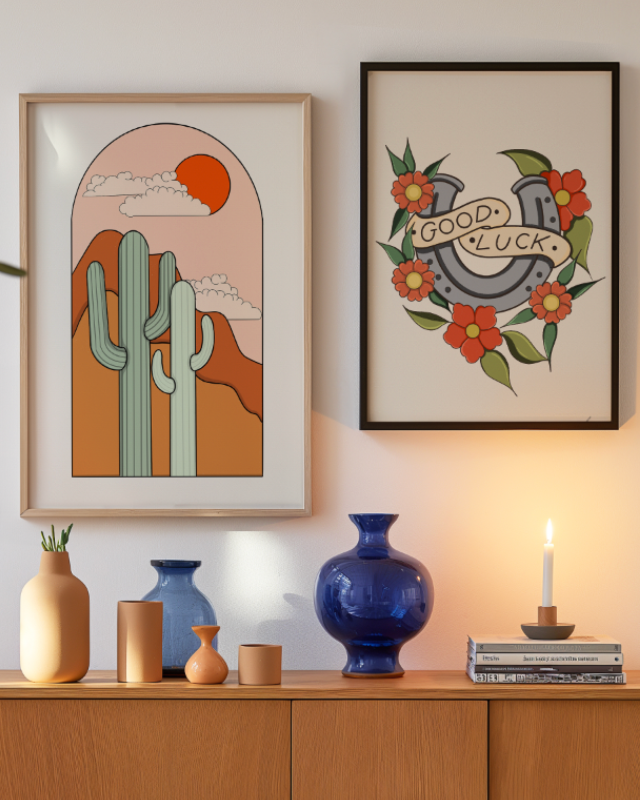
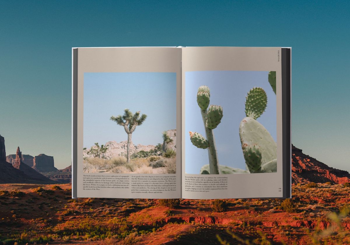
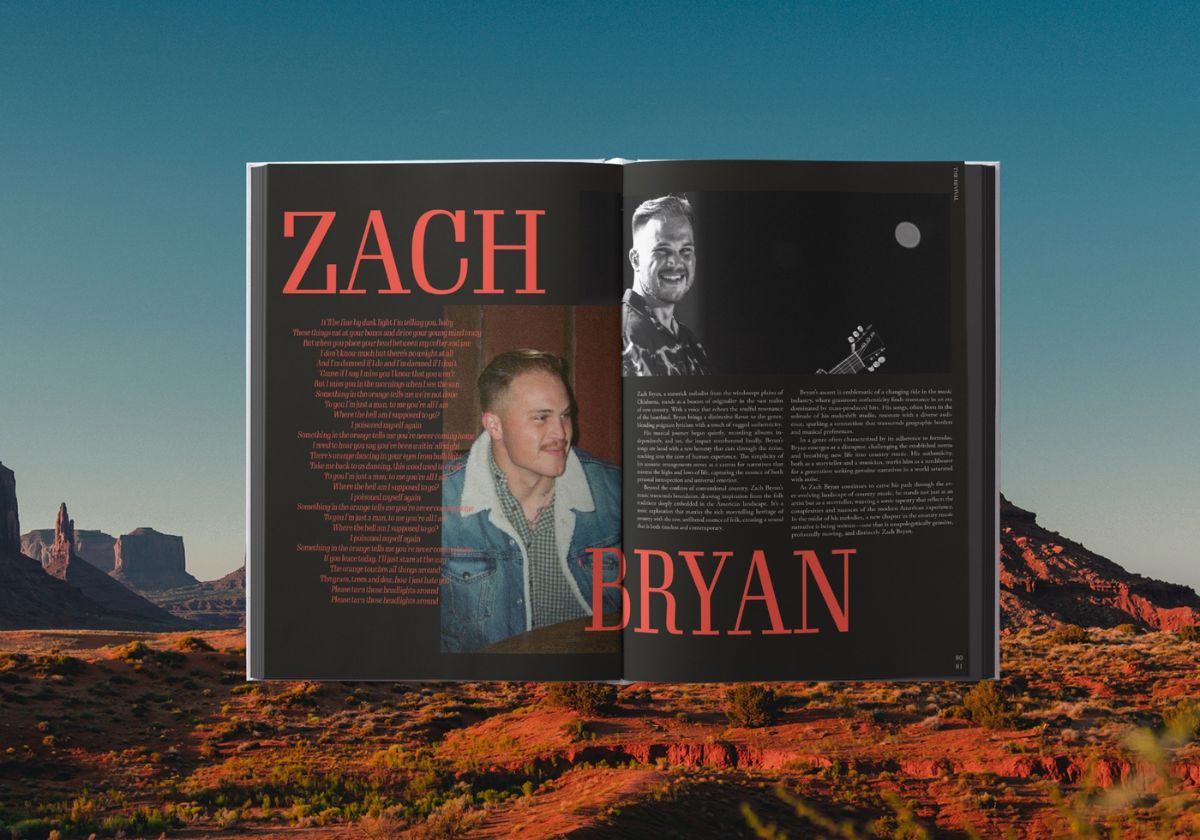
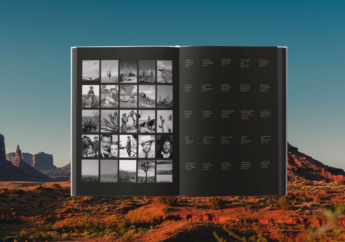
The Revival
The shift of the cowboy
An editorial piece that captures the resurgence of Western culture as younger generations reimagine its traditions with fresh creativity. It highlights how cowboy culture, y'allternative fashion, and modern country music blend authenticity with innovation—celebrating the enduring spirit of the West in a new era.


I want you to panic
Stories as Networks
A non-interactive web piece inspired by Greta Thunberg’s speech, “Panic like the house is on fire.” Designed to echo film end credits, the site evokes the quiet grief that follows the end of something beautiful. There’s no option to scroll backwards, mirroring the irreversibility of climate damage.
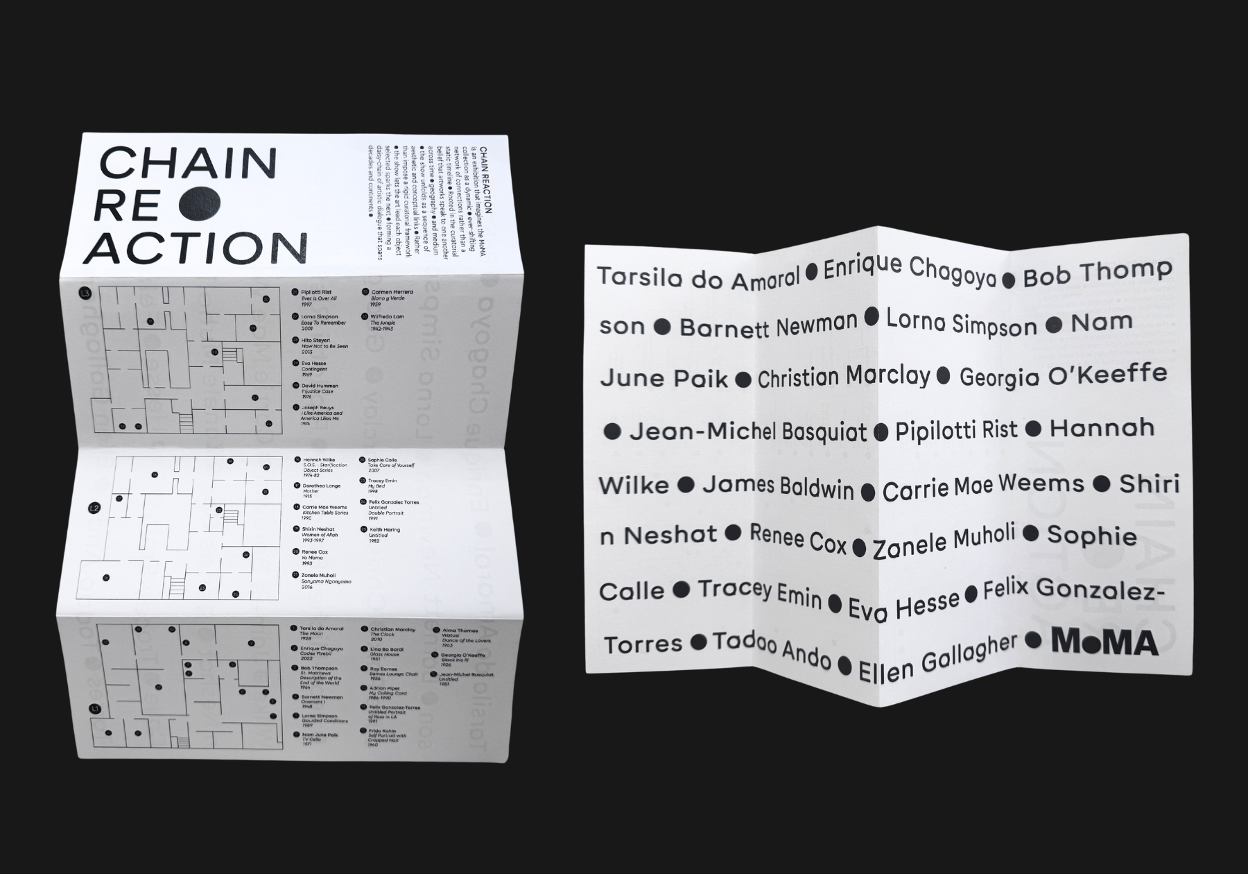
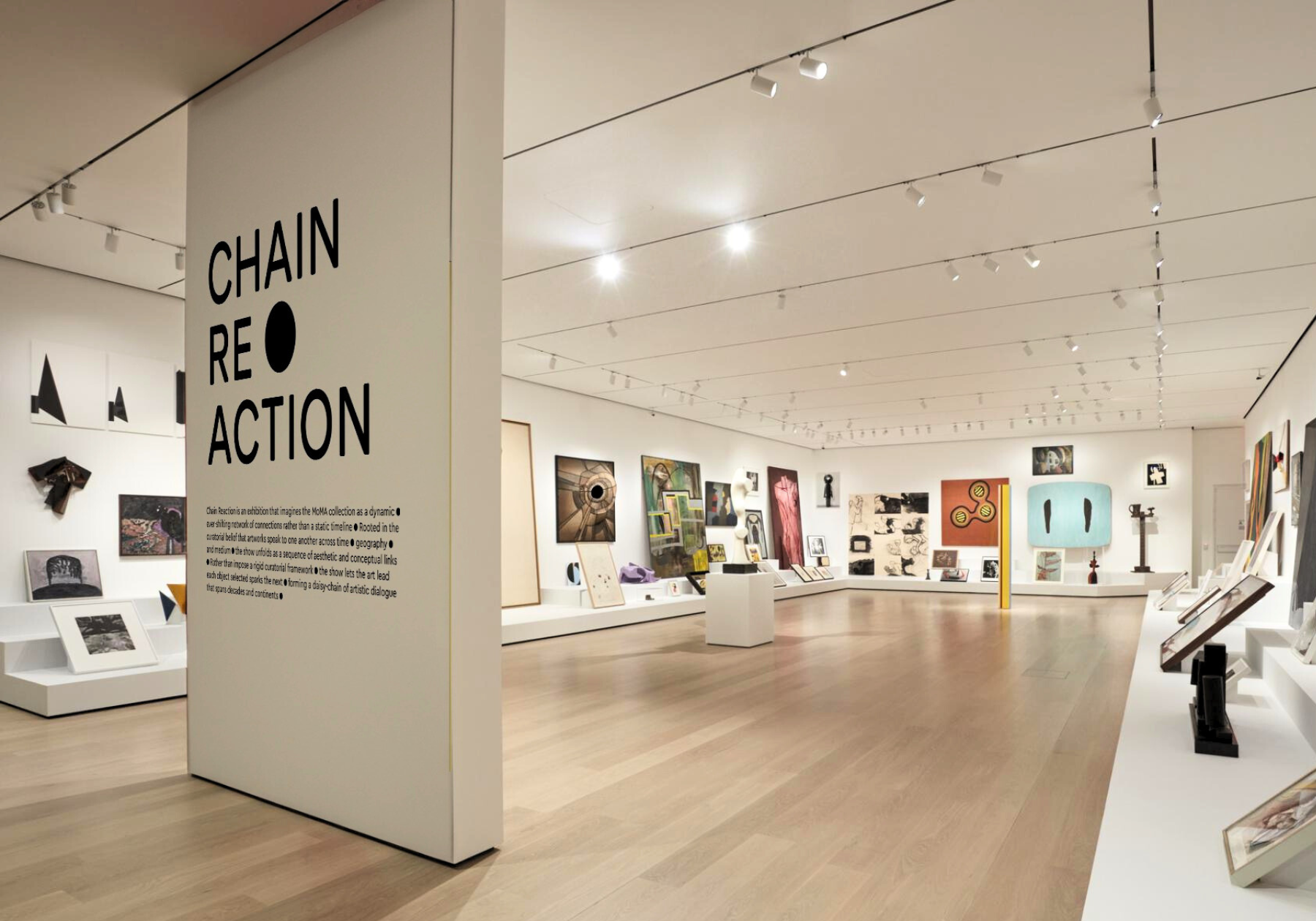
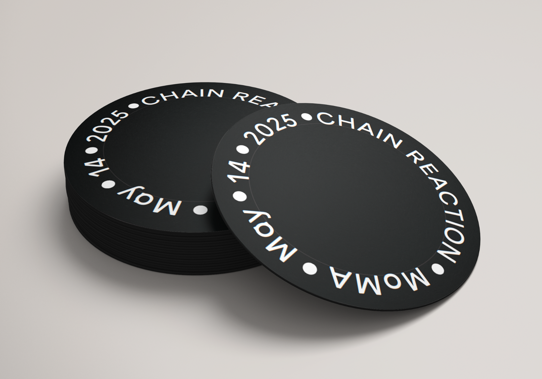
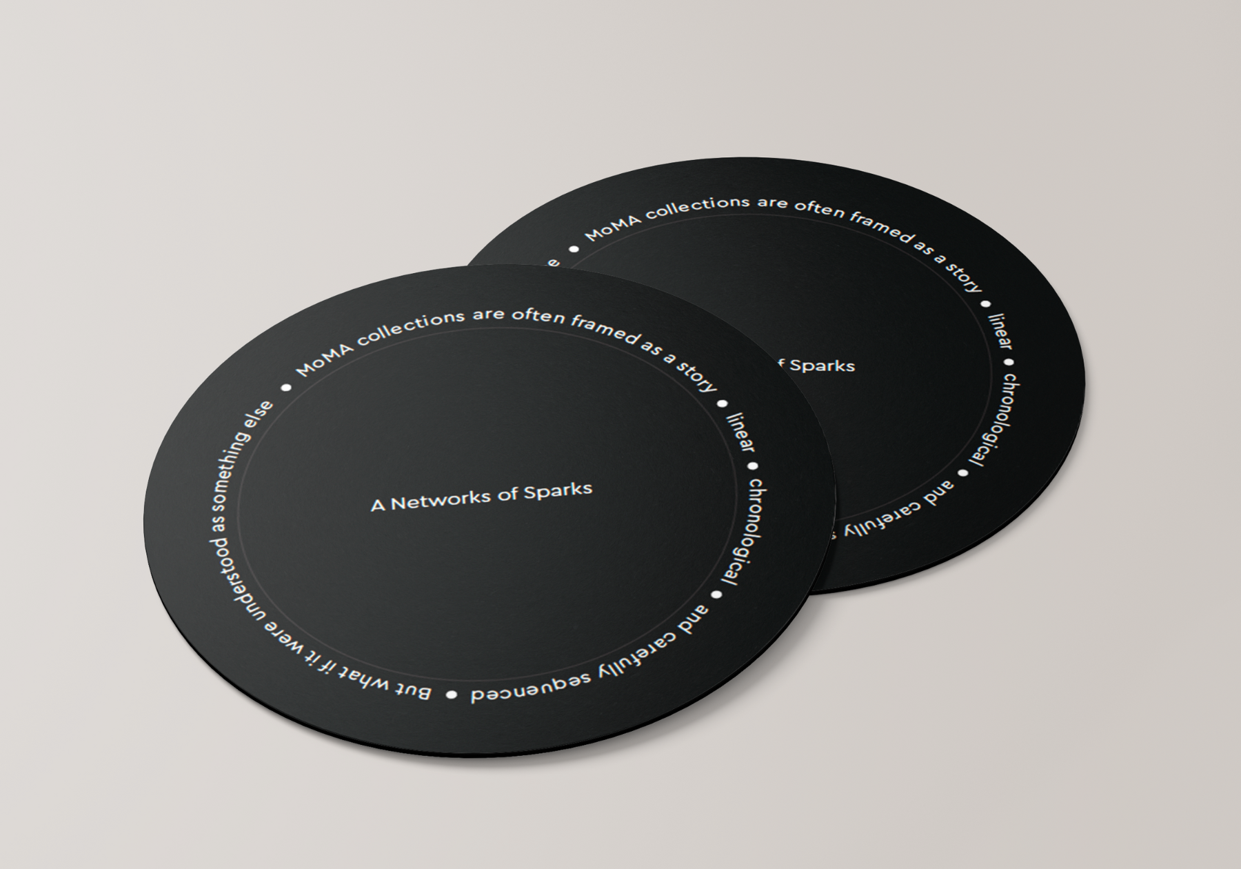
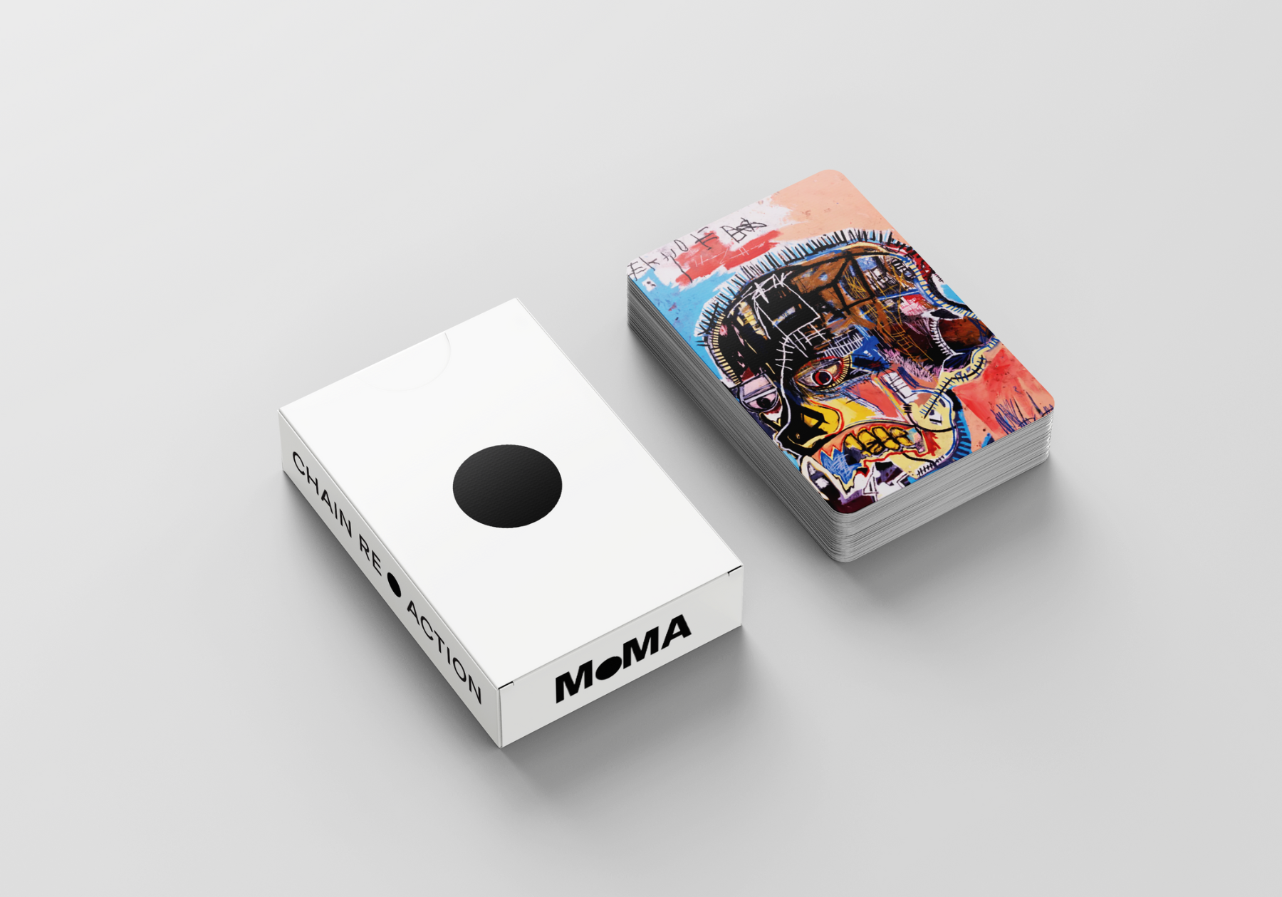
Chain Reaction
User Experience | MoMA
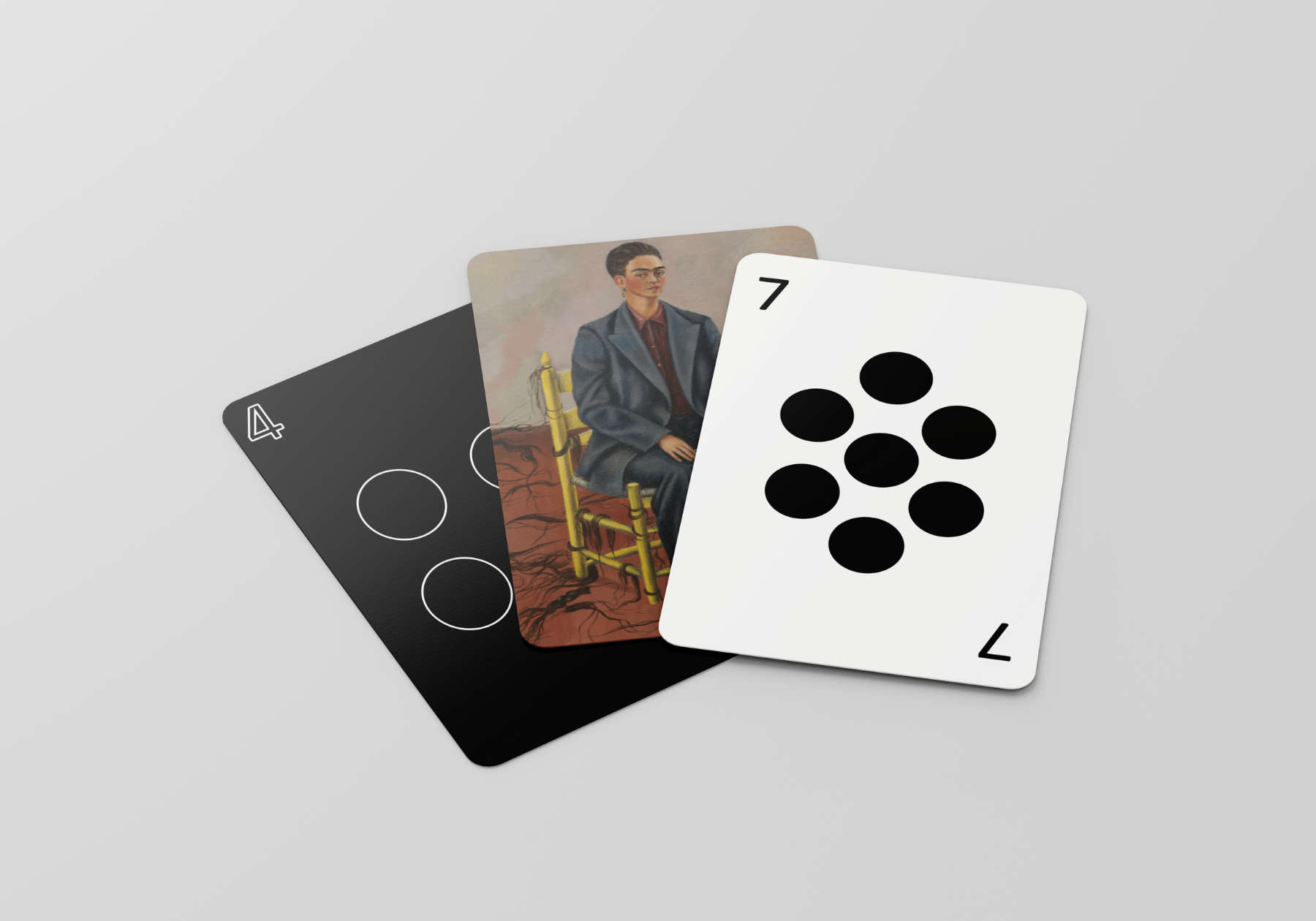
Chain Reaction is an exhibition concept for MoMA that explores how one artwork sparks another. Visually making connection to a Newton’s Cradle and used it as a direct design reference. The design uses two typefaces built from perfect circles to reflect that sense of connection and movement. A single black dot became the main visual element and even replaced traditional punctuation, symbolizing the moment where ideas meet and energy transfers. The result is a clean, rhythmic identity that captures how art continuously inspires what comes next.
Disco Daddy
Illustrations
Coming soon…